Contents
More customization of BrowseFragment
– Multiple rows icon alignment on ListRow
Continuing from the previous chapter, BrowseFragment Header customization, I proceed to customizing ListRow.
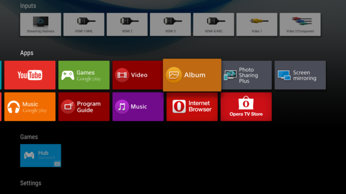
Leanback Launcher app shows multiple rows in Apps, Games bar if the number of icon is many (2 rows are used for “Apps” category in above picture). But original ListRow provided by Leanback support library only allows to show contents in one line. In this chapter, goal is to allow ListRow to show multiple rows in each header, by making customized class of ListRow (Model) and ListRowPresenter (Presenter).
Explanation: Dig in source code
ListRow (Model), ListRowView (View), ListRowPresenter (Presenter) is used for MVP architecture of ListRow. When you read the source code of ListRowPresenter, you can find member of HorizontalGridView in ViewHolder.
public static class ViewHolder extends RowPresenter.ViewHolder {
    final HorizontalGridView mGridView;
    ...
    public final HorizontalGridView getGridView() {
        return mGridView;
    }
}
This mGridView is the container for showing icon contents of ListRow. And Also, This HorizontalGridView supports a method setNumRows, to specify how many number of rows should be used for the layout of HorizontalGridView.
So we only need to call setNumRows method for mGridView, implementation is easy as follows.
Making CustomListRow
Create a new class, CustomListRow class, at model package. This is a subclass of ListRow, and the only one difference from the parent class is that it has a member called mNumRows which specifies the number of rows.
package com.corochann.androidtvapptutorial.model;

import android.support.v17.leanback.widget.HeaderItem;
import android.support.v17.leanback.widget.ListRow;
import android.support.v17.leanback.widget.ObjectAdapter;

import com.corochann.androidtvapptutorial.ui.presenter.CustomListRowPresenter;

/**
 *  Used with {@link CustomListRowPresenter}, it can display multiple rows.
 *  Use {@link #setNumRows(int)} method to specify the number of rows, default 1.
 */
public class CustomListRow extends ListRow {

    private static final String TAG = CustomListRow.class.getSimpleName();
    private int mNumRows = 1;

    public CustomListRow(HeaderItem header, ObjectAdapter adapter) {
        super(header, adapter);
    }

    public CustomListRow(long id, HeaderItem header, ObjectAdapter adapter) {
        super(id, header, adapter);
    }

    public CustomListRow(ObjectAdapter adapter) {
        super(adapter);
    }

    public void setNumRows(int numRows) {
        mNumRows = numRows;
    }

    public int getNumRows() {
        return mNumRows;
    }

}
Making CustomListRowPresenter
In the same way, create a new class called CustomListRowPresenter, at ui.presenter package. This is a subclass of ListRowPresenter, it calls ViewHolder‘s getGridView().setNumRows() method to apply the number of rows for mGridView.
package com.corochann.androidtvapptutorial.ui.presenter;

import android.support.v17.leanback.widget.ListRowPresenter;
import android.support.v17.leanback.widget.RowPresenter;

import com.corochann.androidtvapptutorial.model.CustomListRow;

/**
 * Custom {@link #ListRowPresenter}, it can have multiple rows.
 *
 * Detail: Internally it is changing {@link ListRowPresenter.ViewHolder}'s
 * {@link ListRowPresenter.ViewHolder#mGridView} to set number of rows.
 */
public class CustomListRowPresenter extends ListRowPresenter {

    private static final String TAG = CustomListRowPresenter.class.getSimpleName();

    public CustomListRowPresenter() {
        super();
    }

    @Override
    protected void onBindRowViewHolder(RowPresenter.ViewHolder holder, Object item) {
        /* This two line codes changes the number of rows of ListRow */
        int numRows = ((CustomListRow) item).getNumRows();
        ((ListRowPresenter.ViewHolder) holder).getGridView().setNumRows(numRows);

        super.onBindRowViewHolder(holder, item);
    }

    @Override
    protected void initializeRowViewHolder(RowPresenter.ViewHolder holder) {
        super.initializeRowViewHolder(holder);

        /* Disable Shadow */
        // setShadowEnabled(false);
    }
}
Shadow customization
If you want to change the shadow effect for ListRow, you can modify Presenter class. setShadowEnabled method is used to enable/disable shadow effect.
You can try uncommenting above source code to see the effect.
Modification in MainFragment
Remaining task is to use CustomListRow and CustomListRowPresenter in MainFragment.
To set Presenter, you can specify it in the constructor of rows adapter
    private void setRows() {
        mRowsAdapter = new ArrayObjectAdapter(new CustomListRowPresenter()); // Initialize

        ...

        /* Set */
        setAdapter(mRowsAdapter);

    }
Change ListRow to CustomListRow, and set the number of rows.
    private CustomListRow mGridItemListRow;

    mGridItemListRow = new CustomListRow(gridItemPresenterHeader, gridRowAdapter);
    private ArrayList<CustomListRow> mVideoListRowArray;

    CustomListRow videoListRow = new CustomListRow(header, cardRowAdapter);
    videoListRow.setNumRows(2);
    mVideoListRowArray.add(videoListRow);
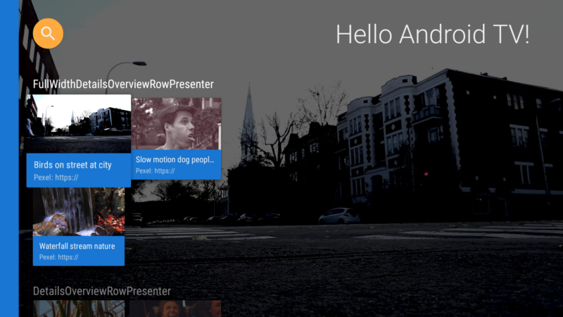
Build and run

2 rows are used to display video contents, with CustomListRow & CustomListRowPresenter as shown in image.
Source code is on github.
Comment – ListRowHoverCardView
Just to note. In the AOSP source code, I could find ListRowHoverCardView class. There is also a javadoc comment in ListRowPresenter which says
* <h3>Hover card</h3>* Optionally, {@link #setHoverCardPresenterSelector(PresenterSelector)} can be used to
* display a view for the currently focused list item below the rendered
* list. This view is known as a hover card
However, I couldn’t find how to use it. Maybe its implementation is not complete?
Reference
- AndroidTV:ListRow, ListRowPresenter (Japanese)