
Contents
- 1 GuidedStepFragment to show Settings display
- 2 Create GuidedStepActivity & Implement onItemClicked in MainFragment
- 3 GuidedStepFragment – Structure
- 4 Overriding Method
- 5 GuidedStepFragment – Minimum Implementation (Overriding method)
- 6 Build and run 1
- 7 GuidedStepFragment – Theme
- 8 SecondStepFragment
- 9 Radio-button type Action
- 10 Build and run 2
GuidedStepFragment to show Settings display
Leanback support library offers a Fragment. Especially, it is useful to use in settings display. Official doc says,
A GuidedStepFragment is used to guide the user through a decision or series of decisions.
I also recommend you to read these references for this topic.
Create GuidedStepActivity & Implement onItemClicked in MainFragment
At first, create GuidedStepActivity by right click your package name New → Java Class → type “GuidedStepActivity” in class name. Note that this GuidedStepActivity doesn’t require res/layout xml file, so it is ok to only create Java class. Make this class subclass of Activity (write ” extends Activity” in class declaration).
Then, let’s make a button to launch this GuidedStepActivity.
    private final class ItemViewClickedListener implements OnItemViewClickedListener {
        @Override
        public void onItemClicked(Presenter.ViewHolder itemViewHolder, Object item,
                                  RowPresenter.ViewHolder rowViewHolder, Row row) {
            // each time the item is clicked, code inside here will be executed.
            if (item instanceof Movie) {
                Movie movie = (Movie) item;
                Log.d(TAG, "Item: " + item.toString());
                Intent intent = new Intent(getActivity(), DetailsActivity.class);
                intent.putExtra(DetailsActivity.MOVIE, movie);

                getActivity().startActivity(intent);
            } else if (item instanceof String){
                if (item == "ErrorFragment") {
                    Intent intent = new Intent(getActivity(), ErrorActivity.class);
                    startActivity(intent);
                } else if (item == "GuidedStepFragment") {
                    Intent intent = new Intent(getActivity(), GuidedStepActivity.class);
                    startActivity(intent);
                }
            }
        }

    private void loadRows() {
        mRowsAdapter = new ArrayObjectAdapter(new ListRowPresenter());

        /* GridItemPresenter */
        HeaderItem gridItemPresenterHeader = new HeaderItem(0, "GridItemPresenter");

        GridItemPresenter mGridPresenter = new GridItemPresenter();
        ArrayObjectAdapter gridRowAdapter = new ArrayObjectAdapter(mGridPresenter);
        gridRowAdapter.add("ErrorFragment");
        gridRowAdapter.add("GuidedStepFragment");
        gridRowAdapter.add("ITEM 3");
        mRowsAdapter.add(new ListRow(gridItemPresenterHeader, gridRowAdapter));

        ...
    }
Add declaration of this Activity to AndroidManifest.
        <activity android:name="GuidedStepActivity"
            android:theme="@style/Theme.Example.Leanback.GuidedStep"/>
So we can start implementing GuidedStepFragment from here. Before real implementation, I will explain a basic structure of this GuidedStepFragment.
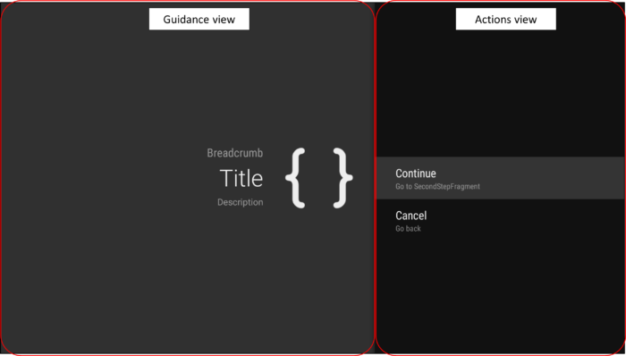
GuidedStepFragment – Structure
As mentioned in official doc, It is composed of a guidance view on the left and a view on the right containing a list of possible actions.
Overriding Method
To use GuidedStepFragment, we need to override at least these 3 methods.
- onCreateGuidance(Bundle)
– To create guidance view (left side).
– Attributes of guidance (title, description etc) are specified here. - onCreateActions(List, Bundle)
– To define list of possible actions (right side).
– Attributes of action are specified here. - onGuidedActionClicked(GuidedAction)
– This is onClick listener.
– Behaviors after clicking action buttons can be specified here.
At least if you know this, you can use GuidedStepFragment. But you may want to modify the design layout of this Guidance. You can use “Theme” & “Stylist” to customize visual styling
Theme
GuidedStepFragment must receive Theme_Leanback_GuidedStep. We can set themes in one of three ways,
1. Set the theme for the host Activity to the GuidedStep theme.
2. The existing Activity theme can have an entry added for the attribute LeanbackGuidedStepTheme_guidedStepTheme.
3. Custom subclasses of GuidedStepFragment may provide a theme through the onProvideTheme() method.
Stylists
You can also use “Stylists” (instead of Presenter which we are using so far to customize visual styling. There are 2 Stylist class.
- GuidanceStylist : left guidance view
– onCreateGuidanceStylist() - GuidedActionsStylist : right actions view
– onCreateActionsStylist()
GuidedStepFragment – Minimum Implementation (Overriding method)
To attach instance of GuidedStepFragment, we can use GuidedStepFragment.add function. Here instance of FirstStepFragment class, which is a subclass of GuidedStepFragment, is added at onCreate of GuidedStepActivity.
Please also check the sample implementation of 3 overriding methods such as, onCreateGuidance, onCreateActions and onGuidedActionClicked.
package com.corochann.androidtvapptutorial;

import android.app.Activity;
import android.app.FragmentManager;
import android.graphics.drawable.Drawable;
import android.os.Bundle;
import android.support.annotation.NonNull;
import android.support.v17.leanback.app.GuidedStepFragment;
import android.support.v17.leanback.widget.GuidanceStylist;
import android.support.v17.leanback.widget.GuidedAction;
import android.util.Log;

import java.util.List;

/**
 * Created by corochann on 24/7/2015.
 */
public class GuidedStepActivity extends Activity {

    private static final String TAG = GuidedStepActivity.class.getSimpleName();

    /* Action ID definition */
    private static final int ACTION_CONTINUE = 0;
    private static final int ACTION_BACK = 1;

    @Override
    protected void onCreate(Bundle savedInstanceState) {
        Log.d(TAG, "onCreate");
        super.onCreate(savedInstanceState);
        if (null == savedInstanceState) {
            GuidedStepFragment.add(getFragmentManager(), new FirstStepFragment());
        }
    }

    private static void addAction(List actions, long id, String title, String desc) {
        actions.add(new GuidedAction.Builder()
                .id(id)
                .title(title)
                .description(desc)
                .build());
    }

    public static class FirstStepFragment extends GuidedStepFragment {
        @NonNull
        @Override
        public GuidanceStylist.Guidance onCreateGuidance(Bundle savedInstanceState) {
            String title = "Title";
            String breadcrumb = "Breadcrumb";
            String description = "Description";
            Drawable icon = getActivity().getDrawable(R.drawable.ic_main_icon);

            return new GuidanceStylist.Guidance(title, description, breadcrumb, icon);
        }

        @Override
        public void onCreateActions(@NonNull List actions, Bundle savedInstanceState) {
            addAction(actions, ACTION_CONTINUE, "Continue", "Go to SecondStepFragment");
            addAction(actions, ACTION_BACK, "Cancel", "Go back");
        }

        @Override
        public void onGuidedActionClicked(GuidedAction action) {

            switch ((int) action.getId()){
                case ACTION_CONTINUE:
                    // FragmentManager fm = getFragmentManager();
                    // GuidedStepFragment.add(fm, new SecondStepFragment());
                    break;
                case ACTION_BACK:
                    getActivity().finish();
                    break;
                default:
                    Log.w(TAG, "Action is not defined");
                    break;
            }
        }
    }
}
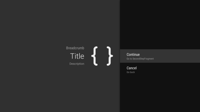
Build and run 1
Guidance should be looks like this.
Source code is on github.
GuidedStepFragment – Theme
I copied res/values/themes.xml from Google sample source code. Then, you can onProvideTheme method to specify customized Theme.
In the AndroidManifest file, specify theme.
        <activity android:name="GuidedStepActivity"
            android:theme="@style/Theme.Example.Leanback.GuidedStep"/>
Which is defined in themes.xml file.
    <style name="Theme.Example.Leanback.GuidedStep" parent="Theme.Leanback.GuidedStep">
        <item name="guidanceIconStyle">@style/Widget.Example.Leanback.GuidanceIconStyle</item>
    </style>
According to official doc,
GuidedStepFragments must have access to an appropriate theme in order for the stylists to function properly. Specifically, the fragment must receive
Theme_Leanback_GuidedStep, or a theme whose parent is set to that theme.
Another way to specify theme is to override GuidedStepFragment.onProvideTheme method.
    public static class FirstStepFragment extends GuidedStepFragment {
        @Override
        public int onProvideTheme() {
            return R.style.Theme_Example_Leanback_GuidedStep_First;
        }
That’s all for implementation of FirstStepFragment, let’s proceed to implment SecondStepFragment.
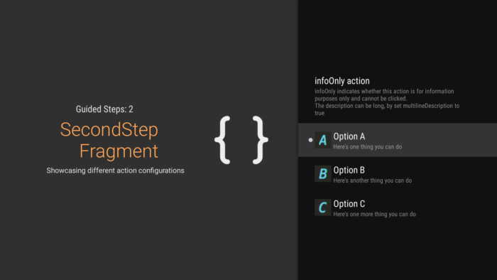
SecondStepFragment
At first let’s implement 3 override methods, onCreateGuidance, onCreateActions and onGuidedActionClicked.
    /* Action set ID */
    private static final int OPTION_CHECK_SET_ID = 10;

    /* Options of SecondStepFragment */
    private static final String[] OPTION_NAMES = {"Option A", "Option B", "Option C"};
    private static final String[] OPTION_DESCRIPTIONS = {"Here's one thing you can do",
            "Here's another thing you can do", "Here's one more thing you can do"};
    private static final int[] OPTION_DRAWABLES = {R.drawable.ic_guidedstep_option_a,
            R.drawable.ic_guidedstep_option_b, R.drawable.ic_guidedstep_option_c};
    private static final boolean[] OPTION_CHECKED = {true, false, false};

    ...

    public static class SecondStepFragment extends GuidedStepFragment {
        @NonNull
        @Override
        public GuidanceStylist.Guidance onCreateGuidance(Bundle savedInstanceState) {
            String title = "SecondStepFragment";
            String breadcrumb = "Guided Steps: 2";
            String description ="Showcasing different action configurations";
            Drawable icon = getActivity().getDrawable(R.drawable.ic_main_icon);
            return new GuidanceStylist.Guidance(title, description, breadcrumb, icon);
        }

        @Override
        public void onCreateActions(List<GuidedAction> actions, Bundle savedInstanceState) {
            String title = "infoOnly action";
            String desc = "infoOnly indicates whether this action is for information purposes only and cannot be clicked.\n" +
                    "The description can be long, by set multilineDescription to true";

            actions.add(new GuidedAction.Builder()
                    .title(title)
                    .description(desc)
                    .multilineDescription(true)
                    .infoOnly(true)
                    .enabled(false)
                    .build());
            for (int i = 0; i < OPTION_NAMES.length; i++) {
                addCheckedAction(actions,
                        OPTION_DRAWABLES[i],
                        getActivity(),
                        OPTION_NAMES[i],
                        OPTION_DESCRIPTIONS[i],
                        OPTION_CHECKED[i]);
            }
        }

        @Override
        public void onGuidedActionClicked(GuidedAction action) {
            String text = OPTION_NAMES[getSelectedActionPosition() - 1] + " clicked";
            Toast.makeText(getActivity(), text, Toast.LENGTH_SHORT).show();
        }
    }
addCheckedAction method in onCreateActions will make radio button type action list.
    private static void addCheckedAction(List<GuidedAction> actions, int iconResId, Context context,
                                         String title, String desc, boolean checked) {
        GuidedAction guidedAction = new GuidedAction.Builder()
                .title(title)
                .description(desc)
                .checkSetId(OPTION_CHECK_SET_ID)
                .iconResourceId(iconResId, context)
                .build();
        guidedAction.setChecked(checked);
        actions.add(guidedAction);
    }
checkSetId method is the key to achieve this. When you specify actions with same setId, you can select only one of this action.
GuidedStepFragment – Stylist
Finally, customize stylist. To customize left side guidance view, call onCreateGuidanceStylist.
    public static class SecondStepFragment extends GuidedStepFragment {

        ...

        @Override
        public GuidanceStylist onCreateGuidanceStylist() {
            return new GuidanceStylist() {
                @Override
                public int onProvideLayoutId() {
                    return R.layout.guidedstep_second_guidance;
                }
            };
        }
    }
Sample layout file looks like this, so you can specify layout of the guidance view inside this layout file.
<?xml version="1.0" encoding="utf-8"?>
<FrameLayout xmlns:android="http://schemas.android.com/apk/res/android"
    xmlns:tools="http://schemas.android.com/tools"
    android:layout_width="match_parent"
    android:layout_height="match_parent" >

    <RelativeLayout
        android:layout_width="match_parent"
        android:layout_height="match_parent"
        style="?attr/guidanceContainerStyle"
        android:id="@+id/relative_layout">

        <ImageView
            android:id="@+id/guidance_icon"
            style="@style/Widget.Example.Leanback.SecondStepGuidanceIconStyle"
            android:layout_width="188dp"
            tools:ignore="ContentDescription" />

        <TextView
            android:id="@+id/guidance_title"
            android:textColor="@color/guidance_title"
            android:layout_marginLeft="50dp"
            android:layout_marginRight="50dp"
            style="?attr/guidanceTitleStyle"
            android:layout_width="match_parent"
            android:layout_height="wrap_content" />

        <TextView
            android:id="@+id/guidance_breadcrumb"
            android:textColor="@color/guidance_breadcrumb"
            android:textAlignment="center"
            android:gravity="center"
            style="?attr/guidanceBreadcrumbStyle"
            android:layout_width="match_parent"
            android:layout_height="wrap_content" />

        <TextView
            android:id="@+id/guidance_description"
            android:textColor="@color/guidance_description"
            style="?attr/guidanceDescriptionStyle"
            android:layout_width="match_parent"
            android:layout_height="wrap_content" />

    </RelativeLayout>

</FrameLayout>
Build and run 2
Now customized layout guidance view with radio button type actions are implemented.
Source code is on github.